The Process
I hated the 80s growing up and all of a sudden, for the last few months that was all that I’d indulge in. In retrospect, I didn’t take the time to understand it; only now I look back and appreciate a lot of the risks taken back then with movies, video games, and CGI effects.
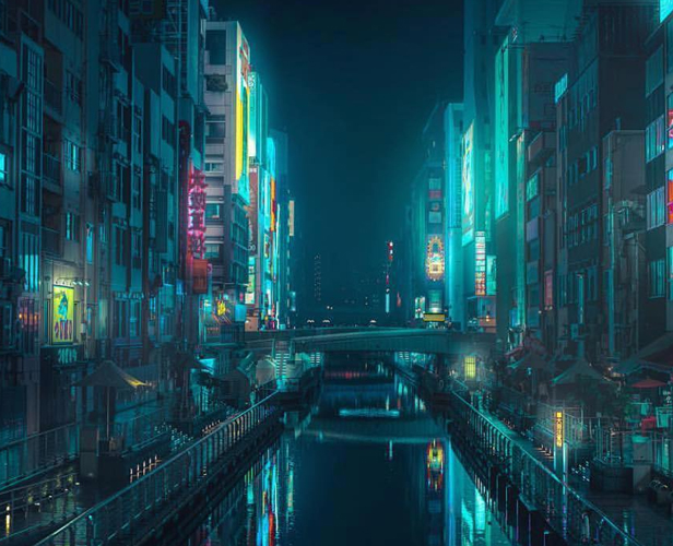
The designs for this project were heavily influenced by the artwork I came across while listening to Synthwave (also known as Retrowave) playlists on Youtube. It was different – it was very nostalgic, there was something dreamlike about it. Even after completing this project, I find myself enjoying a lot of the things I hated about the 80s – the heavy synths, bright purples, leather jackets, and crazy hair. Overall it was a blast bringing these designs to life! Below is a breakdown of my creative process, from the initial sketches to the final product.
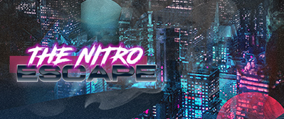
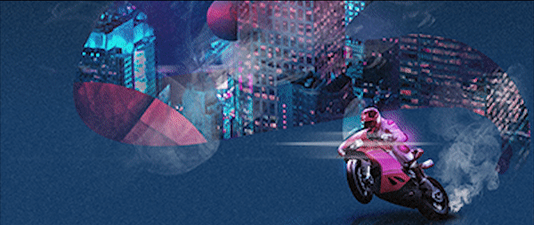
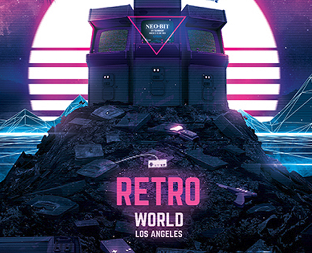
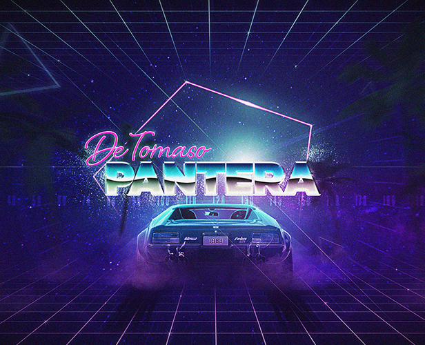
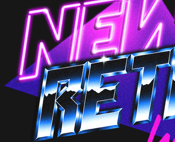
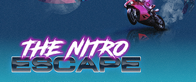
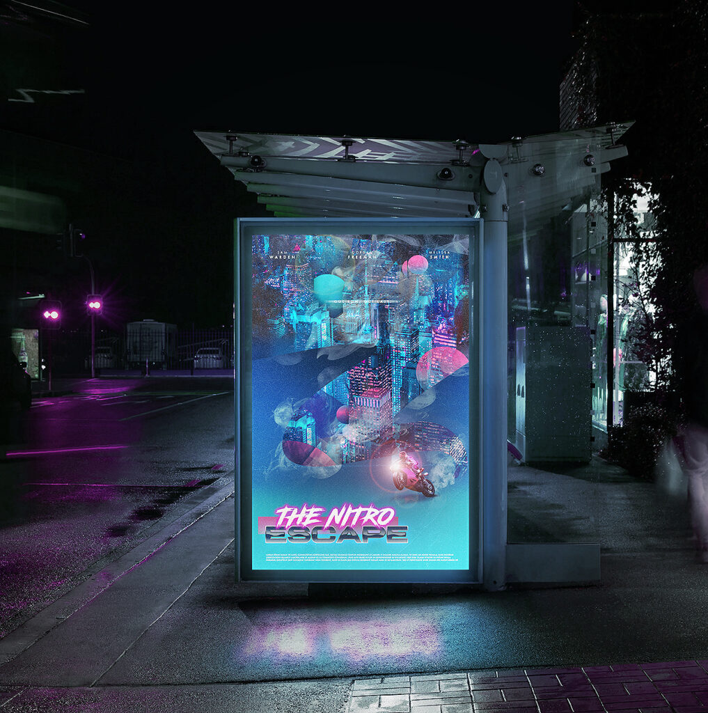
I knew from the very start, I wanted to have the title to have a stylized 80s effect (ref. image 3 & 4). There was an abundance of neon colours, bright pinks, and purples which was something I utilized in my other Cyberpunk project, which you can check out here! Although I wanted to have some fun with these projects, I found it equally important to integrate them in real world settings. I did this by creating mini videos and ads/web banners showcasing different elements of the designs through animated gifs and still images.
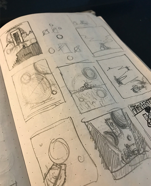
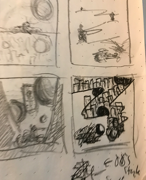
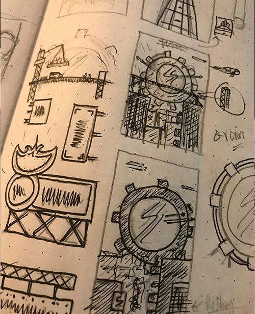
The Initial sketch
The design I’ll be focusing on for this creative overview is The Nitro Escape. I wanted a design that would allow me to play around with the layout, so instead of having the title in the middle, I put it on the side in an attempt to break away from the typical arrangement. It made me very uncomfortable going against the grain in the past, but as I’ve come to learn, all the cool toys are unique. Lastly, one thing I knew I wanted to have in the design was a motorcycle so I began sketching with that in mind.
Photoshop & Illustrator
The Nitro Escape poster was far more image-heavy than the others, which required a lot of photo editing and manipulation. I usually jump back and forth between Photoshop and Illustrator, which is how I usually go about creating my designs, then finally throwing them into After Effects.
Final
The biggest take-away for me for this project was the importance of taking the time to sketch out an idea! I find that it really helps if I allow the world of whatever I’m creating, whether it be through music, movies or images, to consume me while sketching and brainstorming. It’s easy to just jump into the software with the first random idea that pops up in your head, but as I’ve learned over the years, the first idea is usually the weakest – not to say that it’s terrible, but there was so much more I’d be missing out on. By allowing myself to be consumed by the world of cyberpunk I was able to apply the various images and feelings to my design. Not only did I want it to look like a retro design, I also wanted it to feel retro – that without a doubt you knew that the poster was tapping into a specific time.
Extra Content